

Overview
This project explores how to help people with asthma better monitor their condition, understand triggers, and manage medication more easily. My goal was to design an intuitive mobile experience that empowers users to track symptoms, access personalized insights, and stay prepared in daily life.
The Challenge
Aria’s early explorations lacked consistency in tone and expressiveness. To improve the user experience, I needed to define:
- A visual identity that reflects Aria’s intelligence and warmth
- Motion behaviors that show listening, thinking, confidence, or hesitation
- UI patterns that make interactions feel predictable and emotionally clear
The goal was to support efficient interactions while making Aria feel more alive and relatable.
My Role
- UI exploration and brand expression
- Motion and interaction direction
- Concept prototyping
- Visual system refinement
Competitor Analysis & Competitor Research
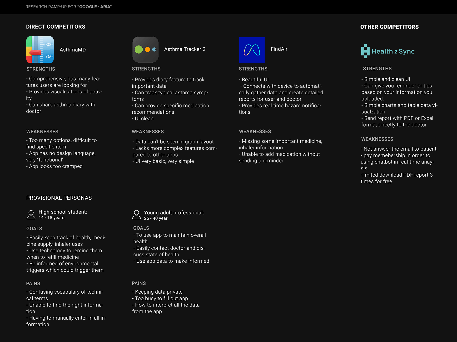
To better understand the problem space, I researched asthma as a condition and reviewed popular asthma-related apps on Google Play. This helped me identify user needs, patterns in existing solutions, and gaps in the current market.
- Key Insights from the Research
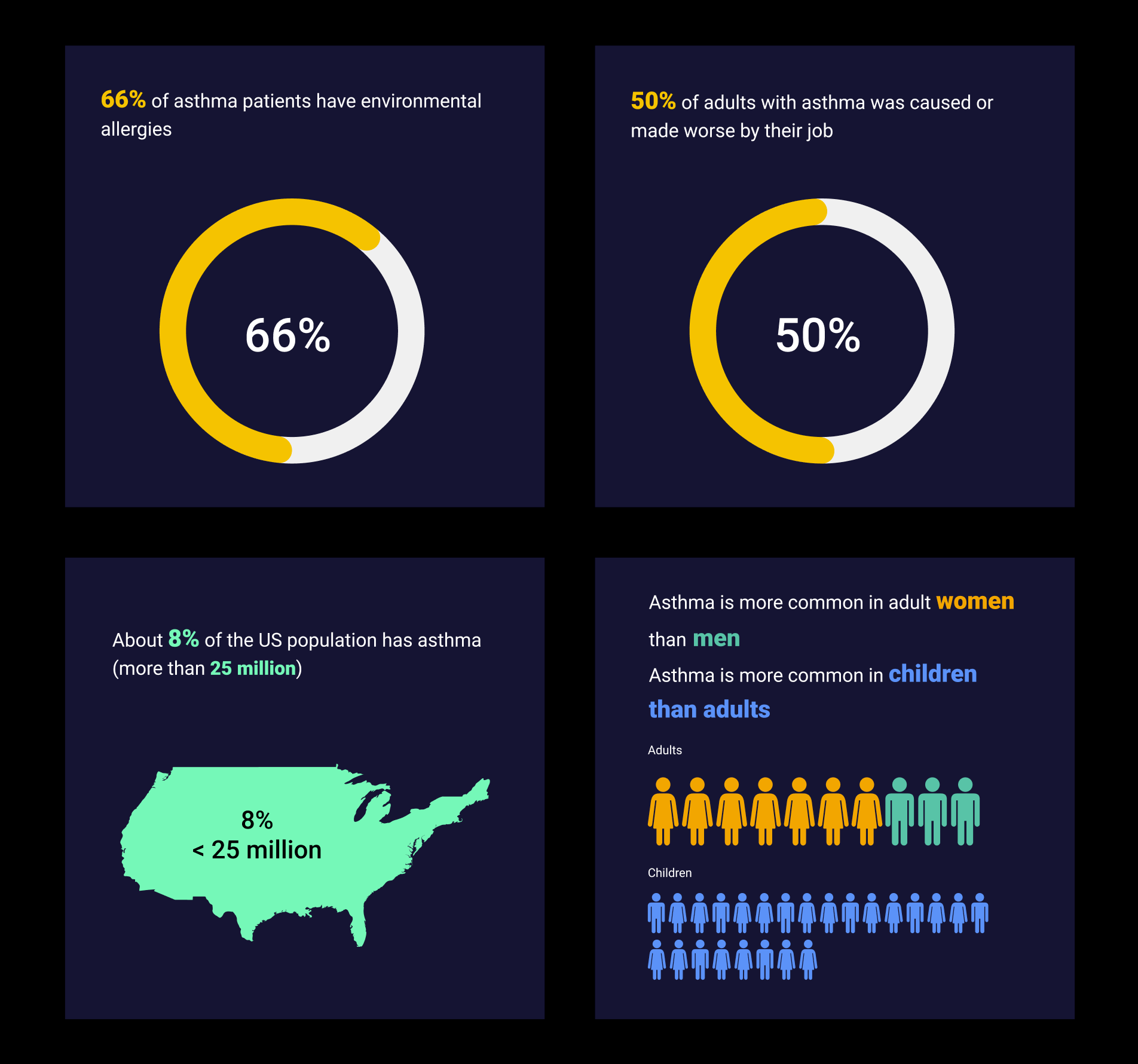
- 8% of the U.S. population (over 25 million people) has asthma.
- Asthma is more common in adult women than in men.
- Asthma is more prevalent in children than in adults.
- 66% of asthma patients also have environmental allergies.
- 50% of adults with asthma report that their job caused or worsened their symptoms.
User Needs — Key Findings
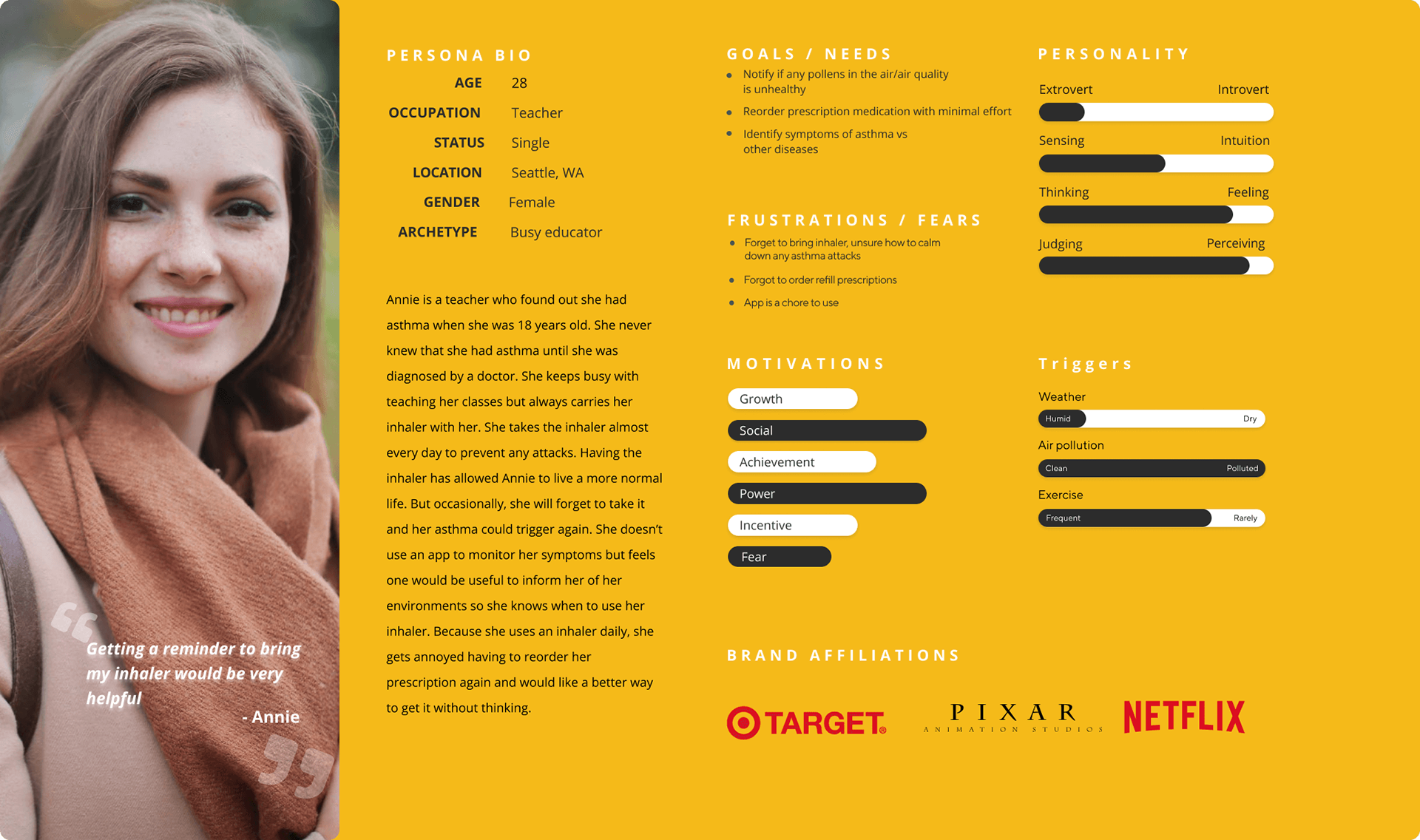
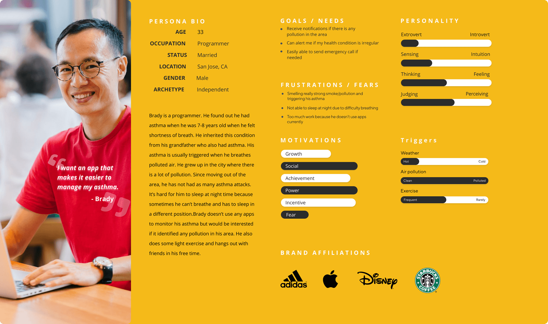
Persona
- Users want a reliable way to monitor air quality and know when triggers are nearby.
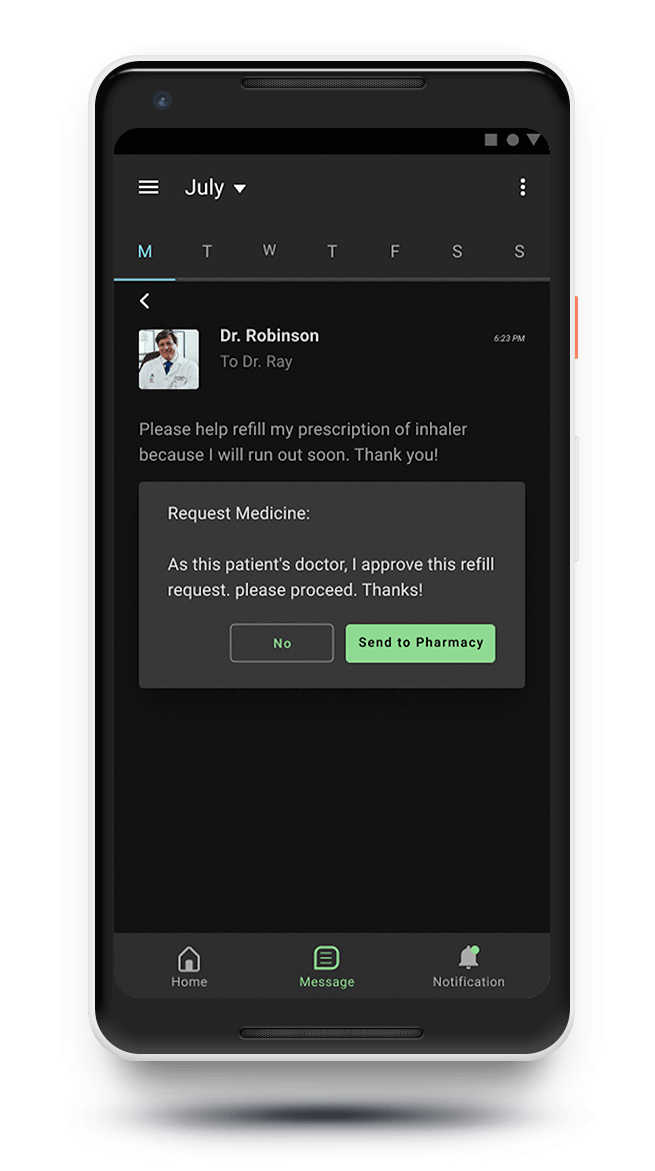
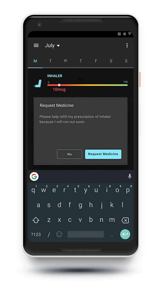
- They need a simpler method for ordering or refilling prescriptions.
- Trigger tracking is useful, but not a top priority.
- Users value tools that help them understand whether a symptom indicates a specific condition or concern.
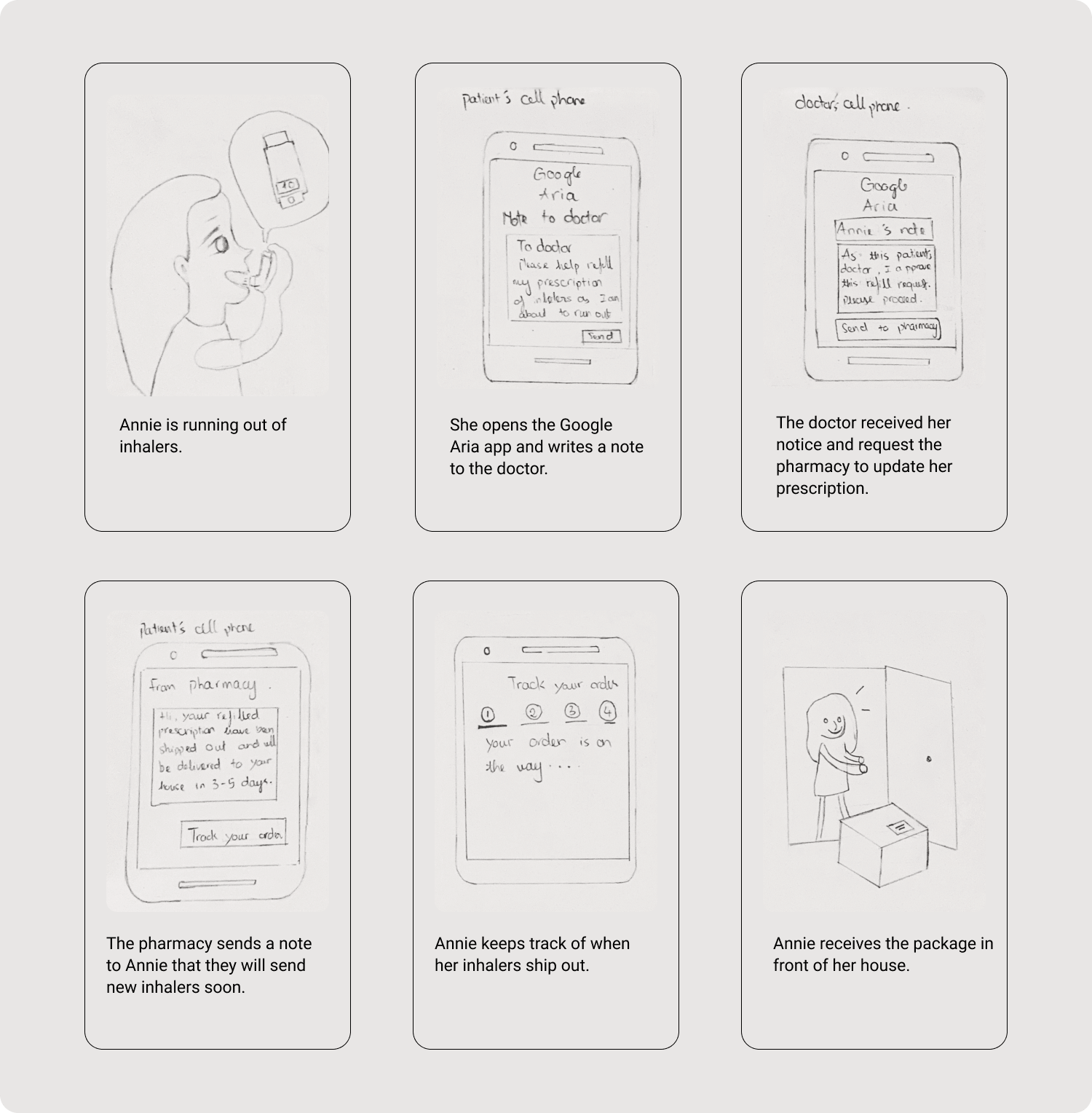
StoryBoard
The storyboard visualizes how an individual with asthma interacts with the app throughout their day. It highlights:
- How users detect environmental triggers
- When they rely on reminders or medication tracking
- How the app fits naturally into daily routines
- How it addresses pain points identified during research
This narrative helped validate the problem and define design opportunities.
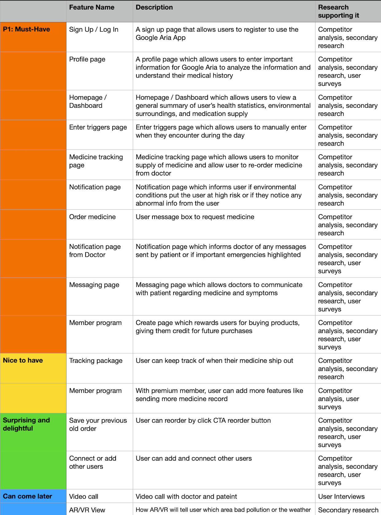
Product Roadmap
Phase 1 — MVP (Core Features)
- Simple symptom logging
- Medication reminders
- Basic trigger tracking
“What is asthma?” educational content
Phase 2 — Enhanced Experience
- Personalized action plans
- Peak flow logging
- Environmental allergy insights
- Weekly/monthly trend reports
Phase 3 — Intelligence & Prediction
- Trigger prediction based on patterns
- Air-quality alerts
- Recommendations tied to behavior & environment
Phase 4 — Healthcare Integration
- Share reports with doctors
- Caregiver/parent monitoring
- Telehealth capability

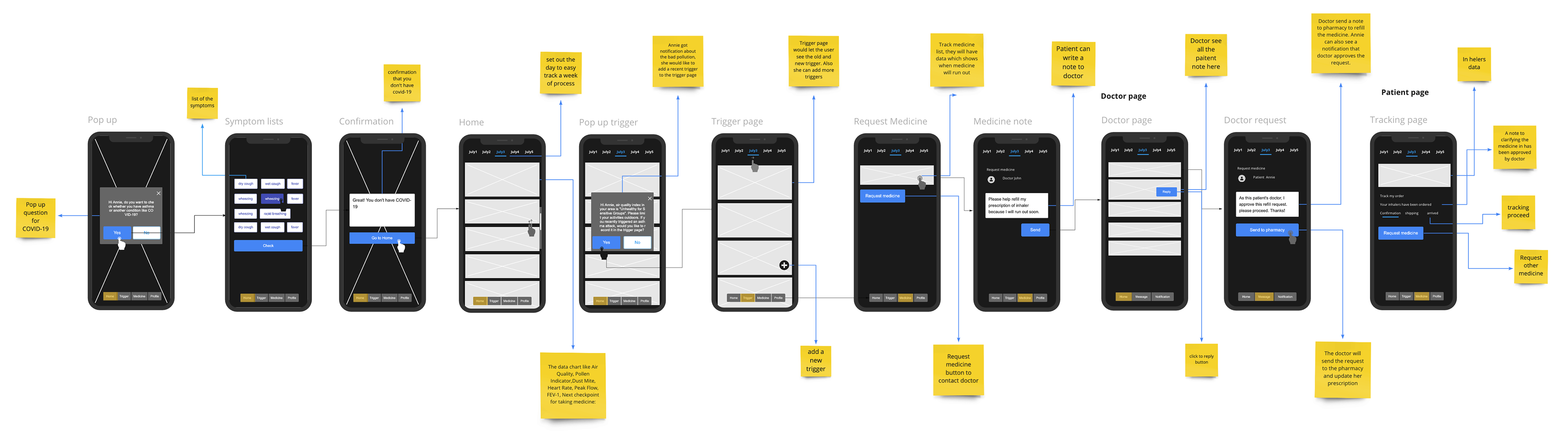
User Flows
- Logging a Symptom
- Setting a Medication Reminder
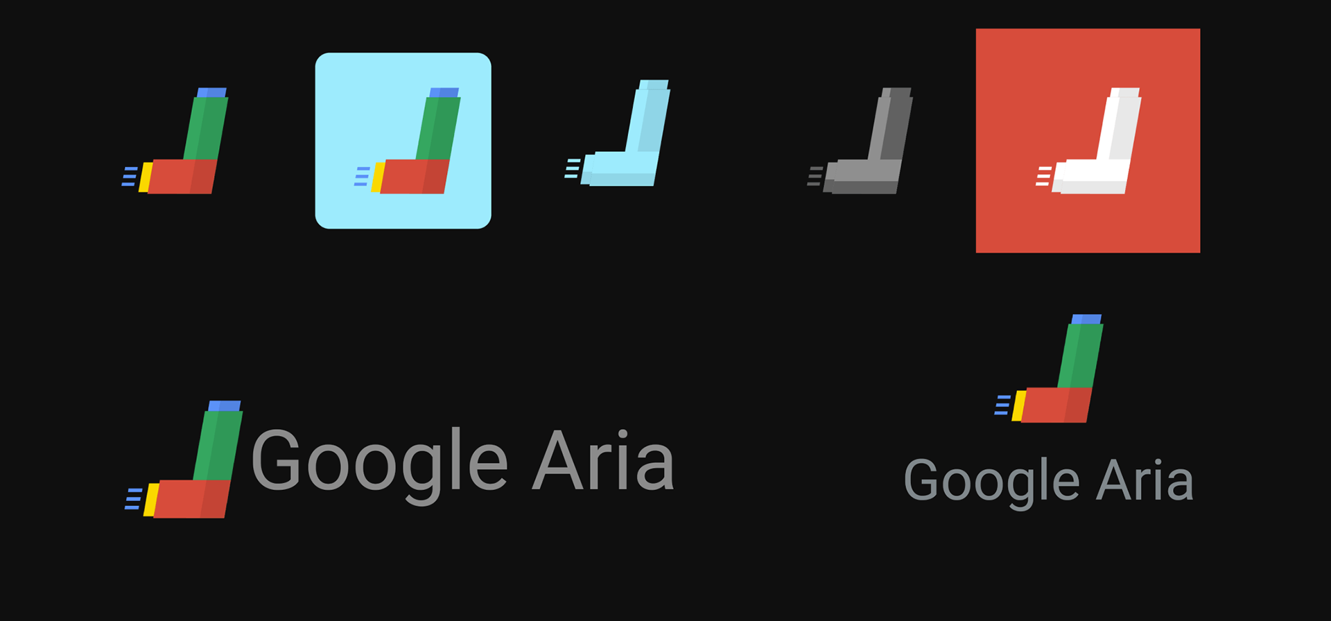
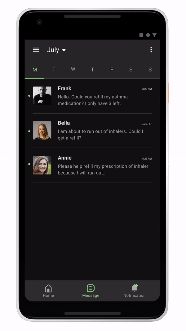
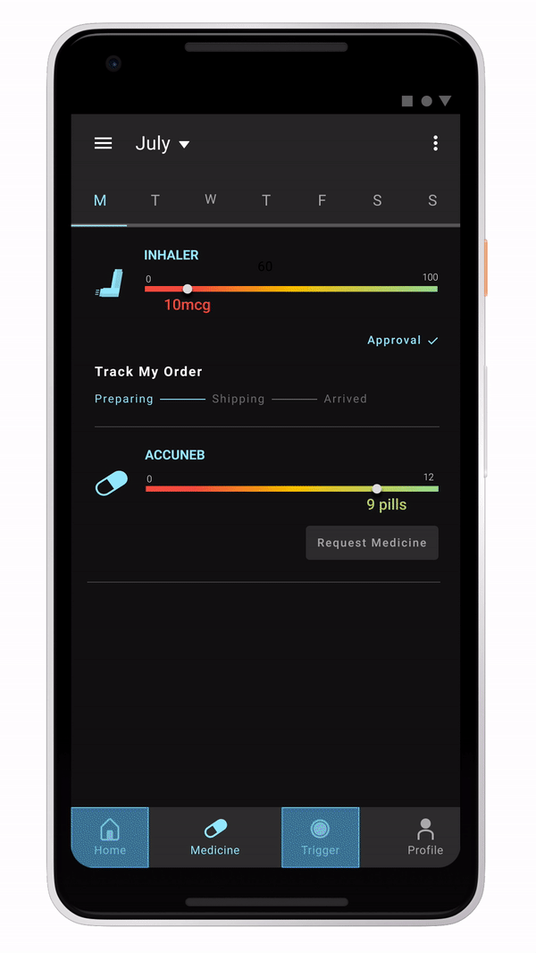
Brand UI Kit
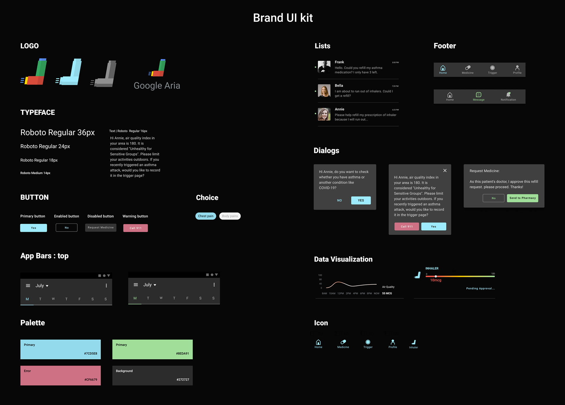
Wireframes & Design Exploration
Low-fidelity wireframes explored:
- Clean navigation
- Simple logging interactions
- Visualizing patterns and trends
- Reducing cognitive load during episodes
Mid/high-fidelity designs focused on:
- Calming color palette
- Clear data presentation
- Easy-to-tap UI components
- Accessible language and iconography
Final Designs
The final UI delivers:
- A clear, calming interface
- Consistent UI patterns
- Seamless symptom and medication tracking
- Actionable environmental insights
- A system that empowers users to stay prepared
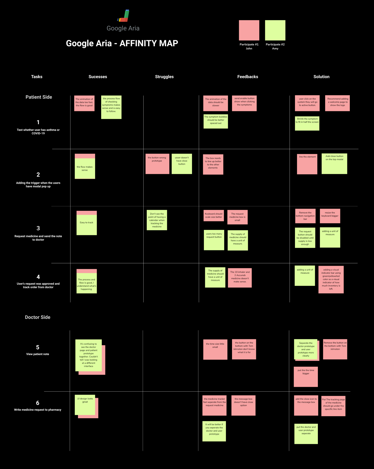
Outcome of the Affinity Mapping Process
The affinity map clarified the core problem areas and informed the feature roadmap. It ensured that the design focused on the highest-value needs:
- Environmental alerts
- Medication management
- Symptom interpretation
- Actionable insights
Outcomes
- Improved visibility into daily symptoms and triggers
- Easier medication management
- A more proactive approach to asthma control
- A strong foundation for predictive health features
What I Learned
Designing for an AI assistant reinforced the importance of:
- Emotional micro-interactions
- Consistency across states
- Clear visual feedback
- Motion that supports understanding (not decoration)
This project strengthened my ability to blend visual design, interaction logic, and motion principles into a cohesive user experience.