DoorDash Delivery Experience Redesign
Improving the delivery workflow for drivers.
UX/UI Design | Product Design | Case Study
Project Overview
Many delivery-workers on DoorDash (or similar apps) report frustration with inefficient delivery flows, unclear status feedback, and challenges managing multiple deliveries or tasks — leading to user errors, delays, and lower satisfaction.
Problem Statement
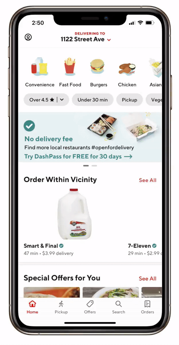
Current delivery UI/UX causes friction for delivery workers by being unclear, cluttered, and inefficient — resulting in delivery delays, confusion, and negative user experience.
How might we redesign the delivery app so that it supports workers with clarity, efficiency, and intuitive flow management?
How might we redesign the delivery app so that it supports workers with clarity, efficiency, and intuitive flow management?
Research & Insights
Key Findings from Research
- Workers often juggle multiple deliveries; switching between tasks is confusing and error-prone.
- Real-time status feedback (picked up / on-route / delivered) is unclear or hard to track under the existing design.
- Poor indication of delivery deadlines or drop-off requirements leads to missed or delayed deliveries.
- Managing multiple stops, navigation, and communication with users — workers need streamlined interfaces.
What This Means: There is a strong need for a delivery-worker-focused experience that helps simplify task management, status awareness, and decision-making under pressure.
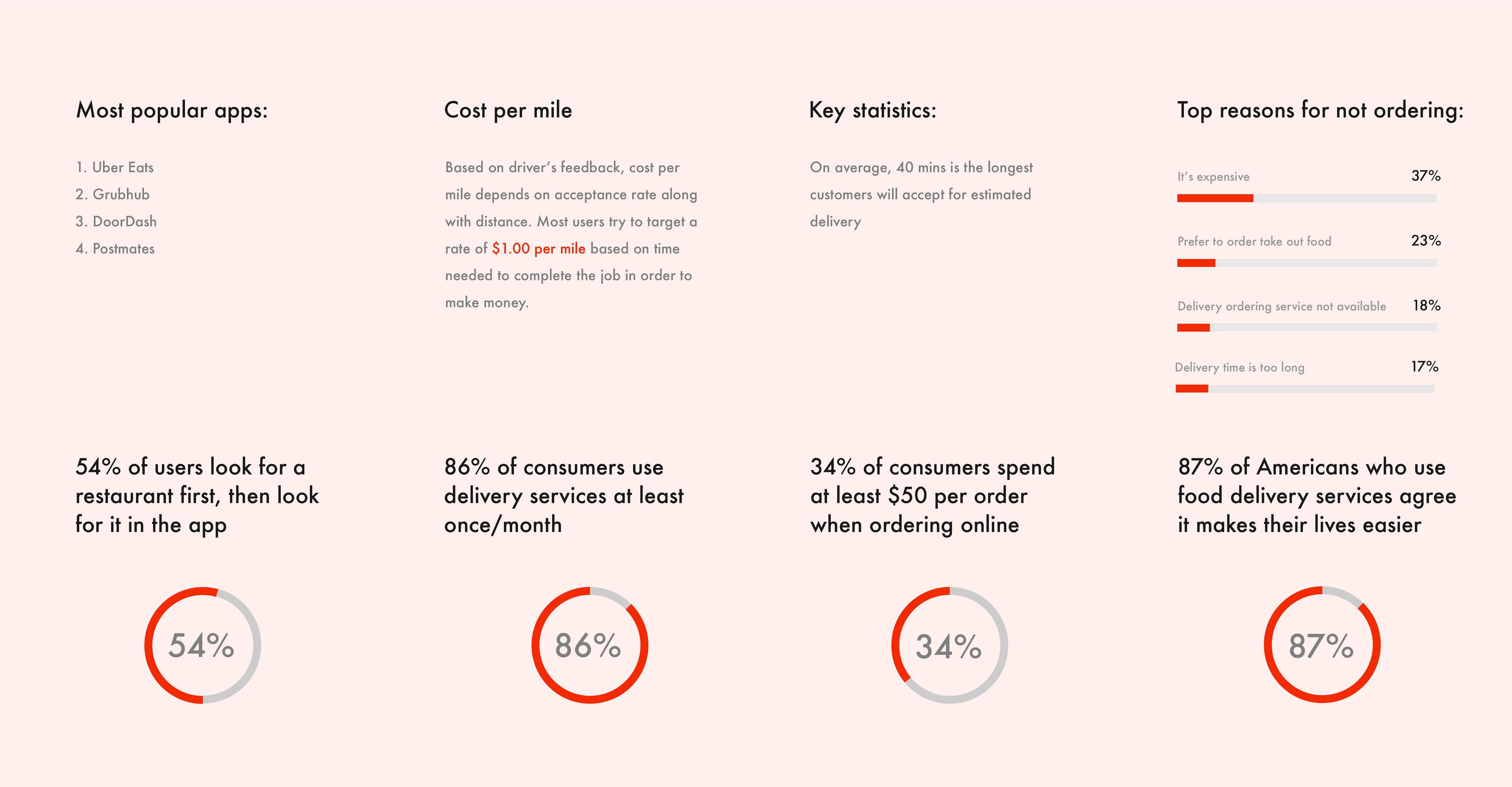
User Research Findings
USER PAIN POINTS
- Hard to manage tasks while driving
- Status unclear (pickup / en route / delivered)
- Switching between orders is error-prone
- Customer instructions are not visible enough
INSIGHTS
- Drivers need clarity & fast actions
- UI must reduce cognitive load
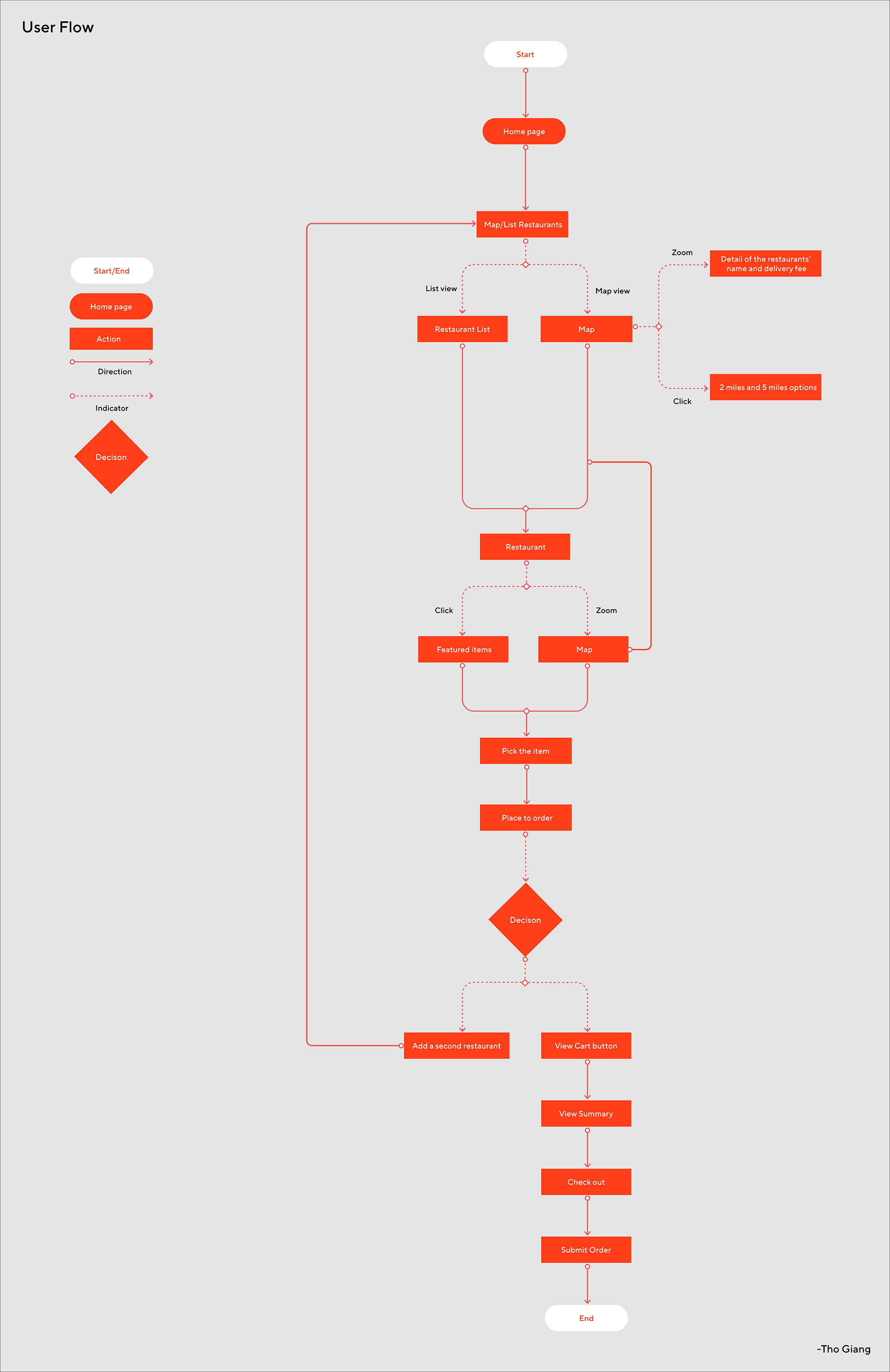
Current vs. Improved User Flow Map
Current Flow
Accept Order → Navigate → Pick Up → Deliver → Confirm
(Confusing, missing feedback)
(Confusing, missing feedback)
Redesigned Flow
Accept Order → Clear Status Card → Step-by-Step Guide →
Detailed Delivery View → Easy Confirmation
Detailed Delivery View → Easy Confirmation
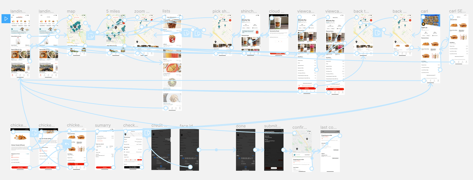
Ideation & Wireframing
- Sketched wireframes for streamlined delivery flow
- Added improved status indicators, clearer task lists, and contextual UI elements
- Designed layout variations for delivery overview vs. step-by-step mode

High-Fidelity Mockups & Prototype
- Converted wireframes into clean UI mocks
- Defined visual hierarchy, clear typography, consistent iconography, and feedback animations
- Created a prototype to simulate real-time interactions (status updates, delivery flow, navigation)
Interaction & Feedback Design
- Designed status badges (Picked Up / In Transit / Delivered / Issue)
- Added confirmation flows for pickups and deliveries
- Included easily accessible delivery info (address, customer notes, ETA, payment status)
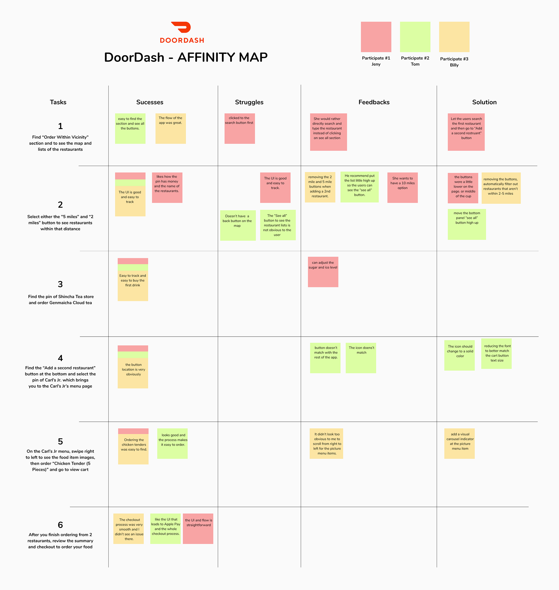
Testing & Iteration (Hypothetical / Self-Review /
Peer Review)
- Reviewed with peers or mentor (or simulate delivery scenarios)
- Collected feedback: clarity on status, ease of navigation, error prevention
- Iterated on UI, spacing, feedback messaging, and flow transitions
Final Design & Key Screens
Screens / Features to Showcase
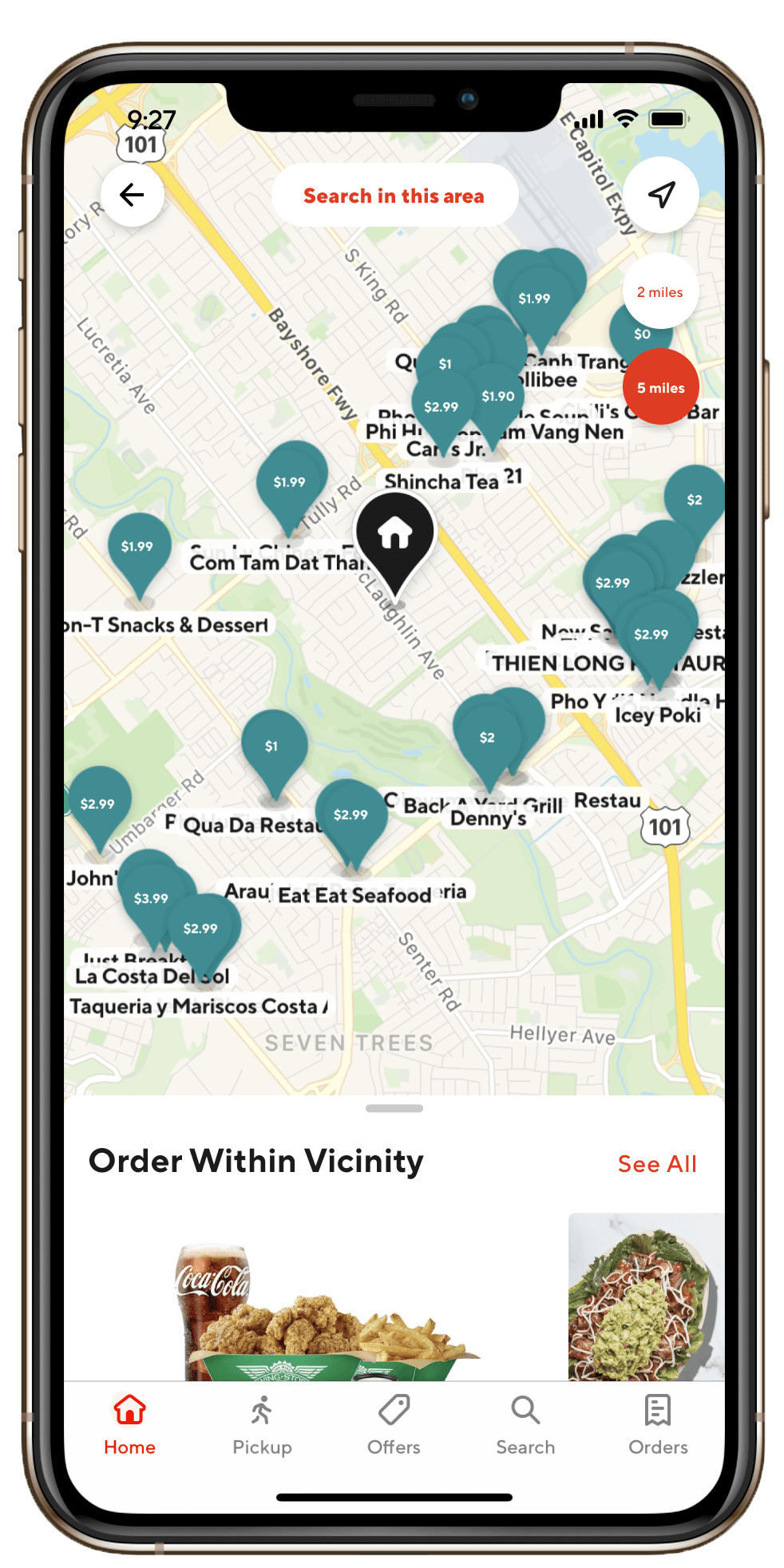
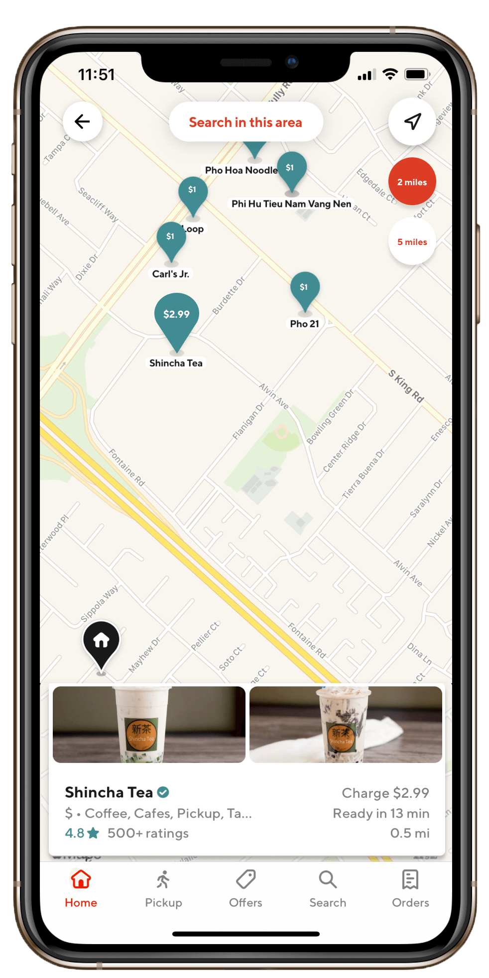
- Delivery overview dashboard (active orders list)
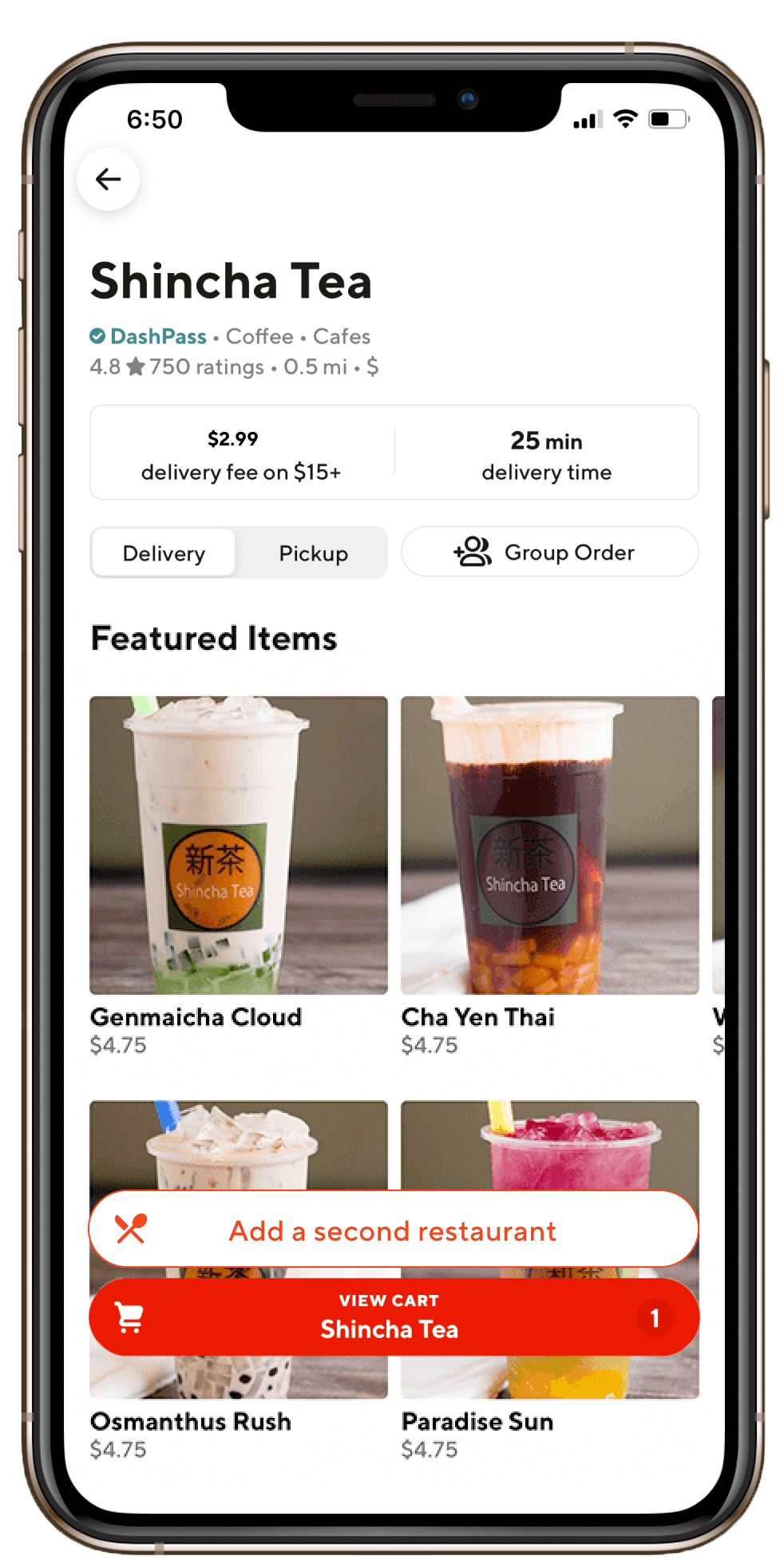
- Order detail & status screen (pickup, route, delivery)
- Navigation + map integration screen
- Confirmation & feedback screen after delivery
- Error/exception screen (issue, delay, cancel)
UI Highlights
- Clean, readable typography and iconography
- Clear visual feedback for status changes
- Minimalist layout — focuses on clarity under pressure
- Easy-to-access controls and task management
What I Learned & Reflection
What I learned:
- Design must support real-world constraints
- Status clarity = fewer errors
- Workflow design is as important as visual design
How I improved:
- Better flows
- Clearer UI hierarchy
- Stronger interaction logic